Someone once told me that a logo is worth a thousand words.
I would probably agree, but change it slightly – a logo is worth the first thousand words your business will ever say.
A logo should do a few things straight off the bat. It should either tell your potential customers exactly what you do; it should create interest enough for them to find out what you do, and it should make you stand out from your competitors in the industry.
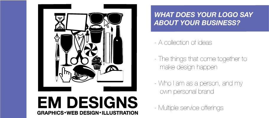
Take my own logo for instance. I get asked about it all the time – what are all the items, what does that have to do with graphic design and social media?
Well I think it has a lot to do with both those things. My logo is made up of illustrations of all the pieces that come together to create design – coffee, pens, paper, a cursor and of course, wine.
My logo works in a few ways. It creates interest. It makes people think, and looks absolutely like nothing else in my industry.

A logo really represents the business that you as a small business owner are trying to build. It should embody the kind of business that you want to be – whether that’s classic, classy, fun or innovative – your logo should show all of that off in the first glance. Its something that should inspire you, make you proud to show off your business and be something that you as the business owner really identify with.
So I want you to think about your own logo – whether its been taken to a graphic designer or its just an idea in your head. Does it make you happy to look at ? Is it distinctive? Have you had positive or negative responses to that logo and are there any possibilities for making changes based on that?
That’s about the emotional connection to the logo, which is the most important part. Then you need to start looking at the form of your logo.
The logo is made up of three distinct parts.

- The Logo Mark
This is the “shape” itself. Its normally where the bulk of the colour (or lack there of) is, and what will get used in your overall branding most. So when you are looking at creating a logo, make sure that this part is strong within itself – its going to be used a lot! Remember that the colour in your logo needs to be just as distinctive or different within your industry as the shape of that logo mark itself.

- The Logo Type
This is where the name of your company, what you do, or even your website address is going to be. The most important part here (because most businesses have a name decided before a logo is made) is choosing a font that is going to work for your printed material and digital space, and that compliments the logo mark. Your graphic designer should offer you up a couple of different logo-mark-with-logo-type options – there comes a point when its down to your personal preference.

- The White Space
Often totally forgotten, this is super important for you. Your designer is going to get it (I hope!), but you are going to be using your logo in all sorts of other ways – on your on your invoices etc – that your designer might not have a hand in. Make sure that your logo gets the respect it serves by giving it some space around it when you use it.
The most important thing to remember is that your logo should be created with the business in mind. Theres absolutely no point in making a logo that looks incredible, if it has nothing to do with your business, and vice versa – don’t settle for a hideous logo just because it’s a cliché identifier for the kind of business you are building.
If you want to speak to me about your current or future logo, get in touch at any time on email, Twitter or Facebook. Whether its an opinion, a revamp or a complete re-do – I want to help you!
Just my final piece – all the logos included in this piece have been designed by me over the past few years. If you want to talk about them with me, Im always interested in hearing your opinions!


