WHY EVERYONE SHOULD HAVE A SIDE HUSTLE
When I got to my third year of design school, I distinctly remember taking on my first ever freelance client. It was [...]

When I got to my third year of design school, I distinctly remember taking on my first ever freelance client. It was [...]

I have been thinking about writing this post for months. I wasn't sure that I should do it, I really didn't want [...]

A few months ago, I wrote this blog on where to find a job as a graphic designer. And while the feedback [...]
No one likes job hunting, no matter what stage of the game you are in. The reality is, working as a designer [...]
As a graphic designer who has a lot of both designer friends and friends running small businesses, I hear horror stories all [...]
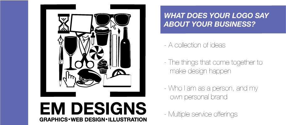
Someone once told me that a logo is worth a thousand words. I would probably agree, but change it slightly – a [...]